Sysdig
Sysdig is the first unified cloud-native visibility + security platform
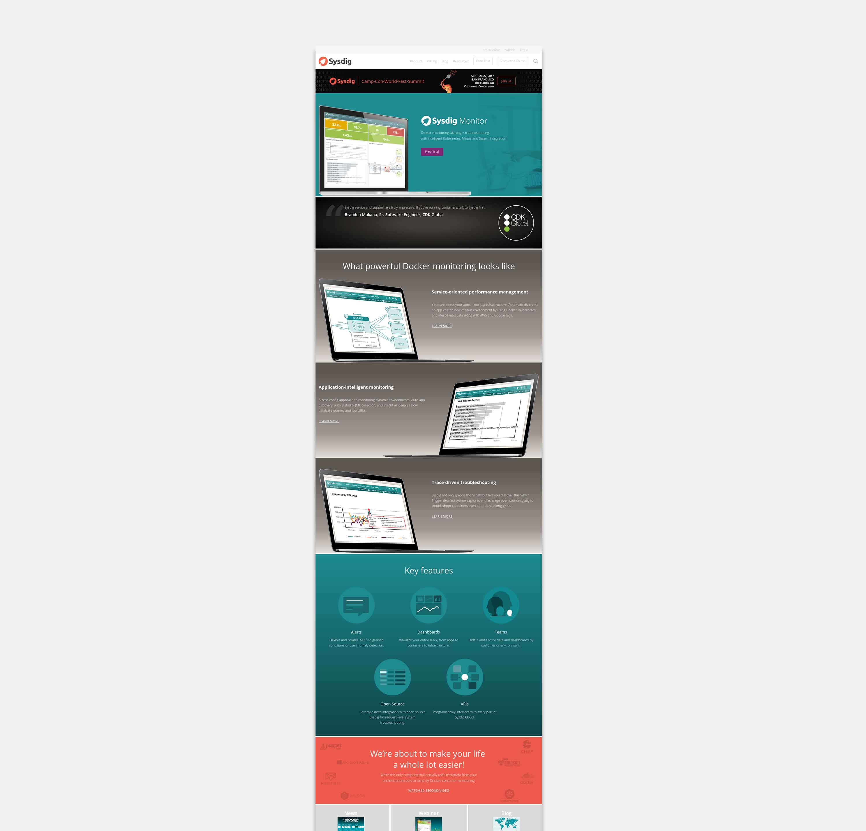
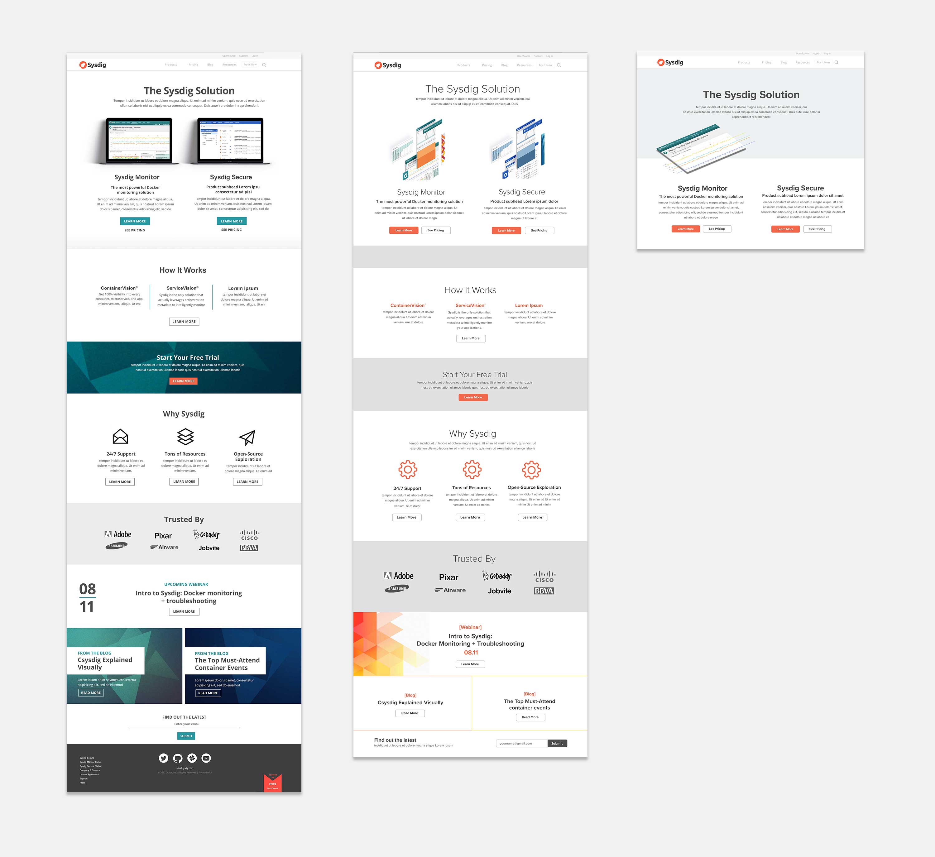
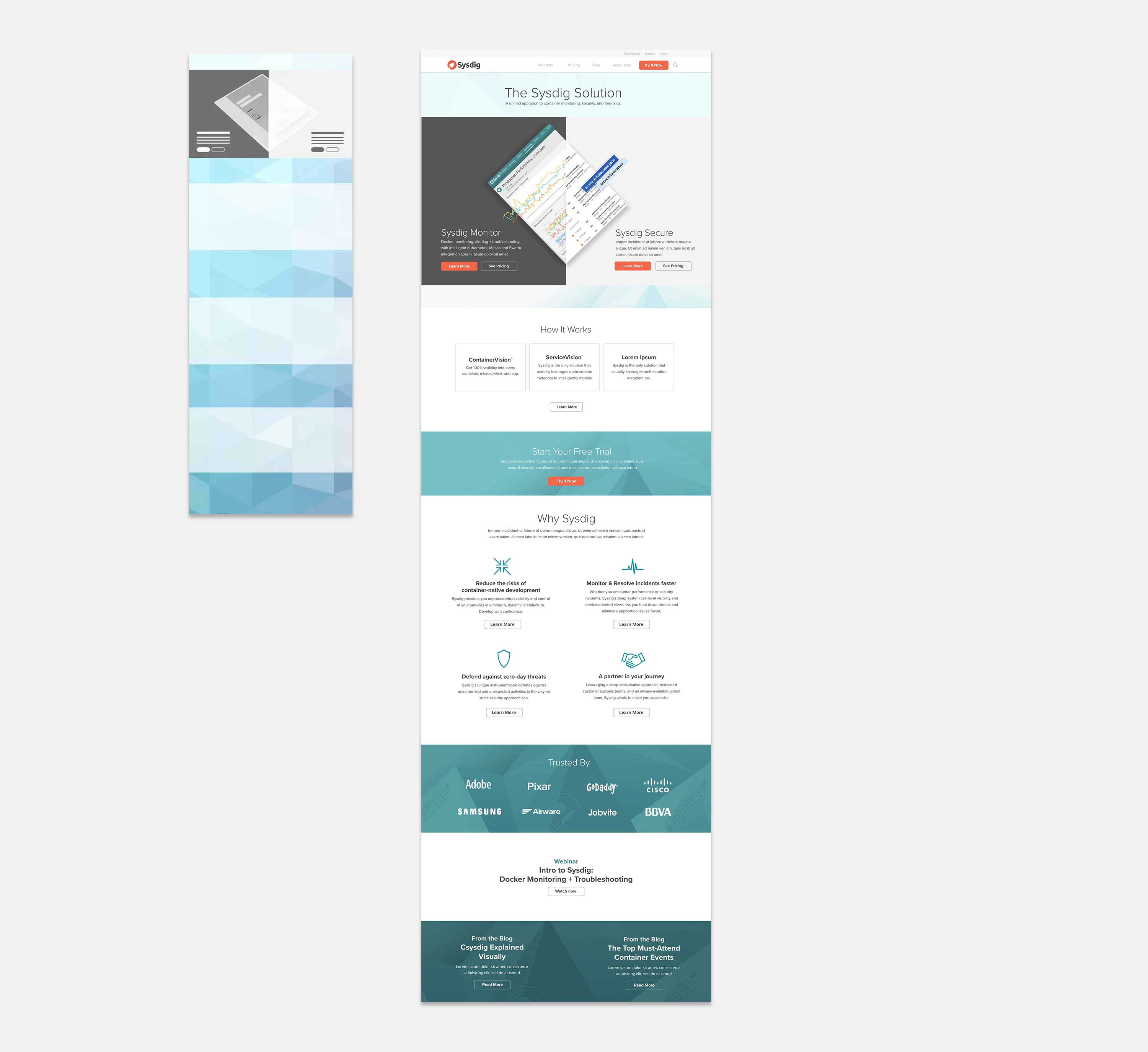
Problem: Our challenge is to introduce Sysdig Secure to the market effectively, positioning it next to the well-established Sysdig Monitor. We need to increase its visibility and adoption among security-conscious users, while maintaining Sysdig Monitor's brand equity and trust. The goal is to differentiate Sysdig Secure and resonate with users, aiming for increased adoption and engagement.
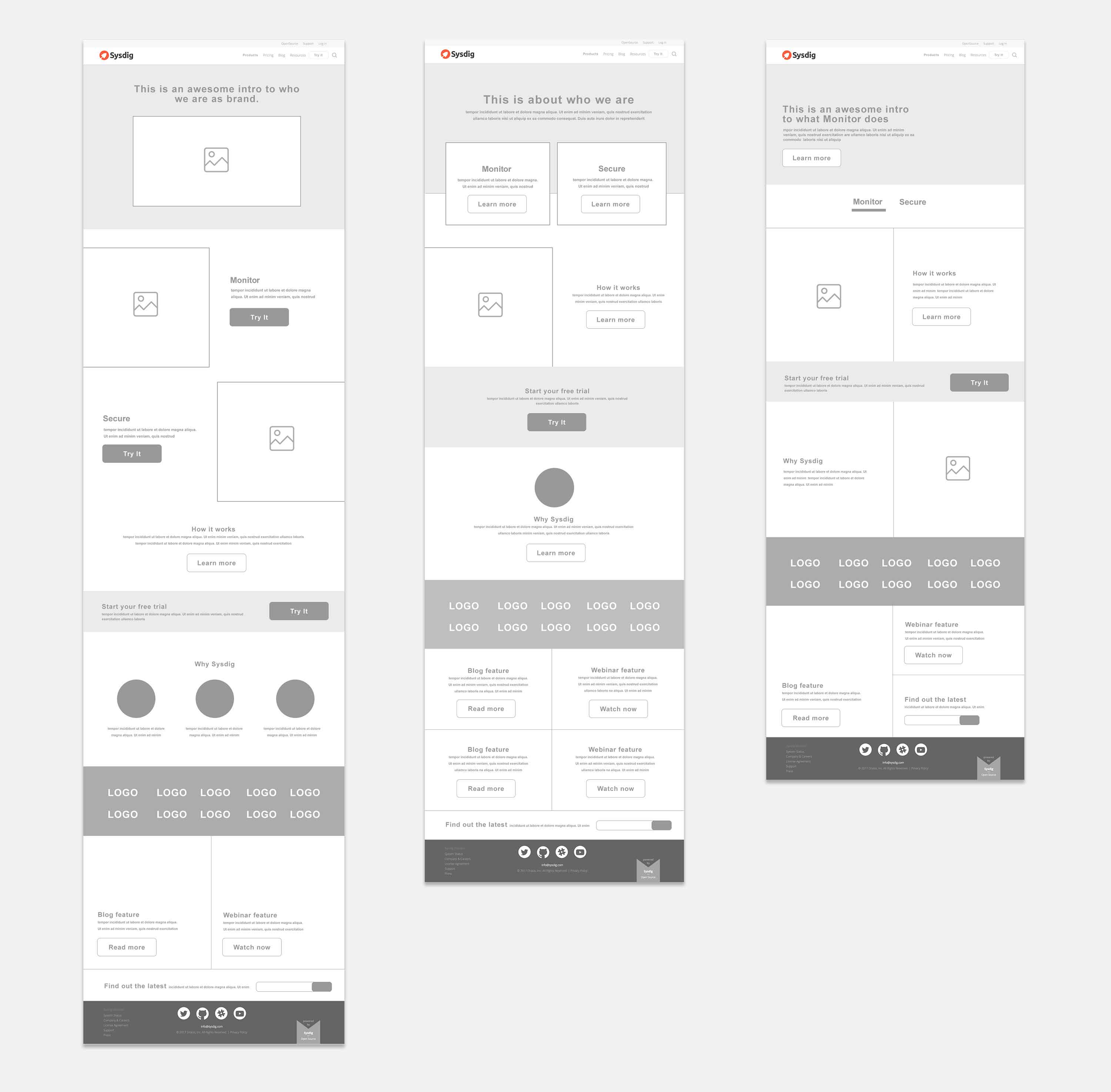
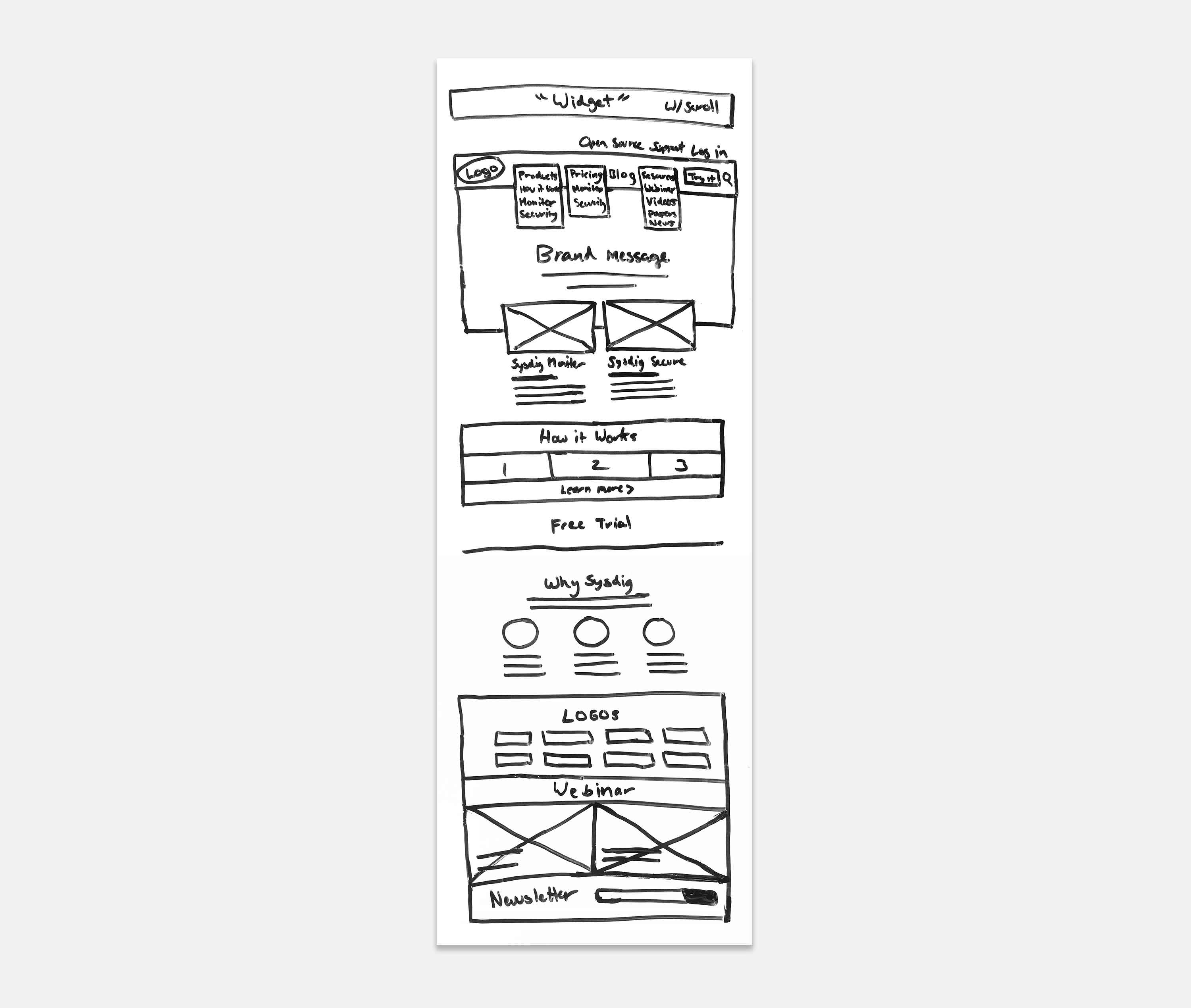
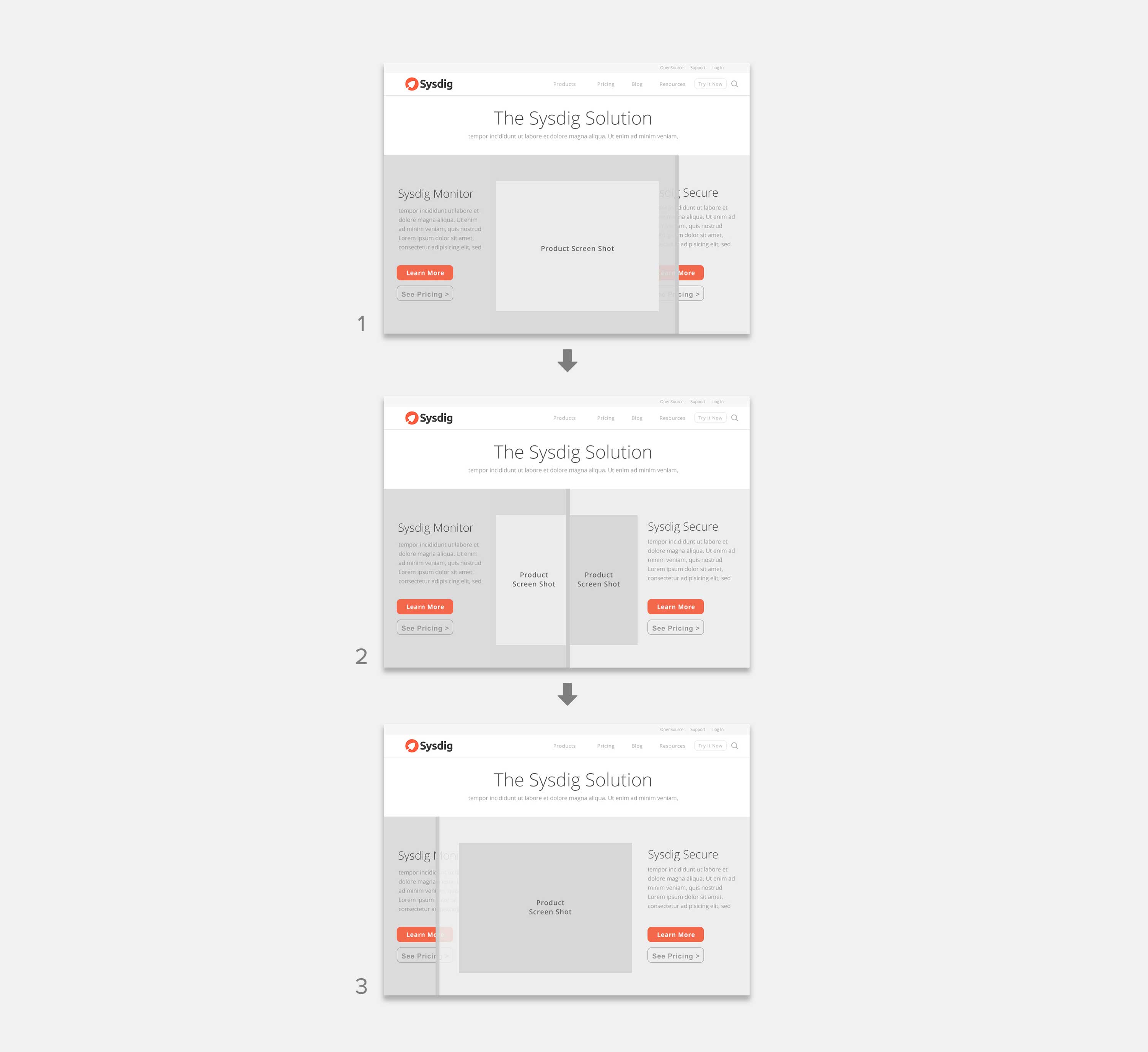
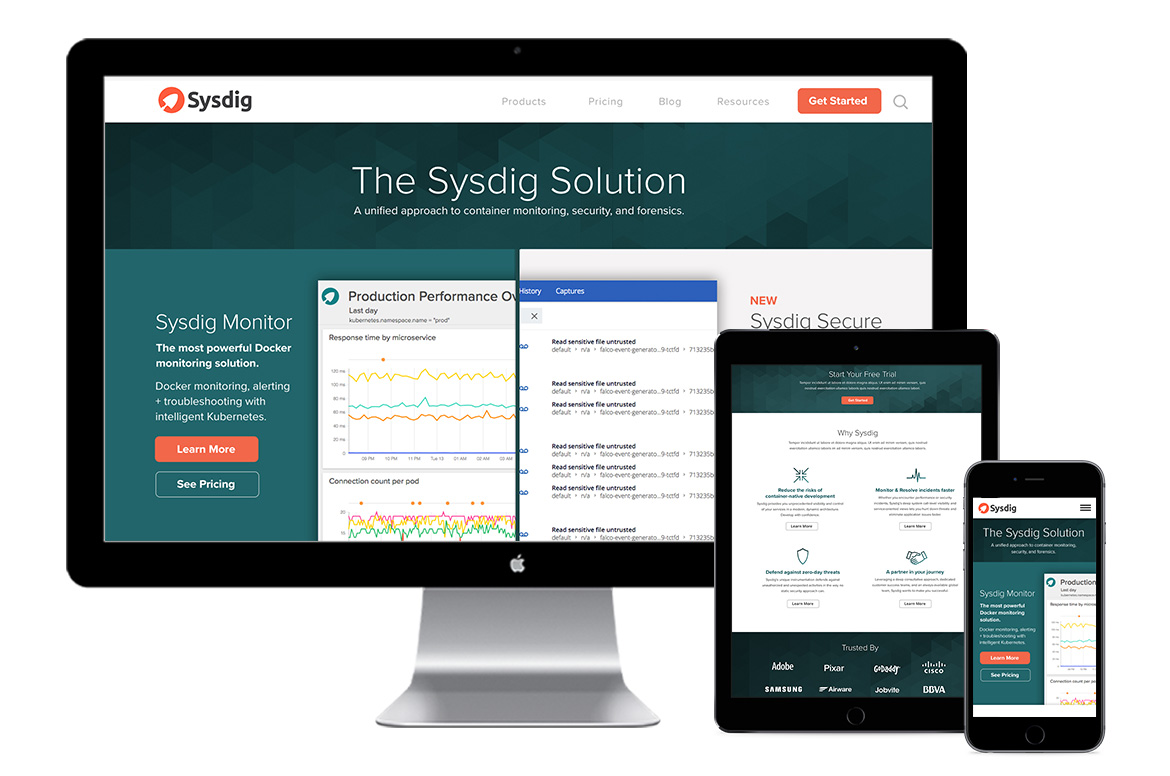
Solution: To enhance user engagement and facilitate a seamless comparison between the existing and new products, our solution utilizes a locked screen with a forced scroll mechanism. The interactive experience begins by prominently displaying the existing Sysdig Monitor, smoothly transitioning into a side-by-side comparison with Sysdig Secure, and culminating in a captivating reveal of the new product. This approach ensures users are introduced to Sysdig Secure in a visually engaging and informative manner, encouraging them to explore its features and benefits.
Team: Design Manager, UX/UI Designer, and Engineer
Role: UX/UI